Why most business websites don't convert.
Most business websites fail quietly: traffic arrives, nothing happens. Here are the six conversion killers we find in almost every website audit — and how to fix each one.
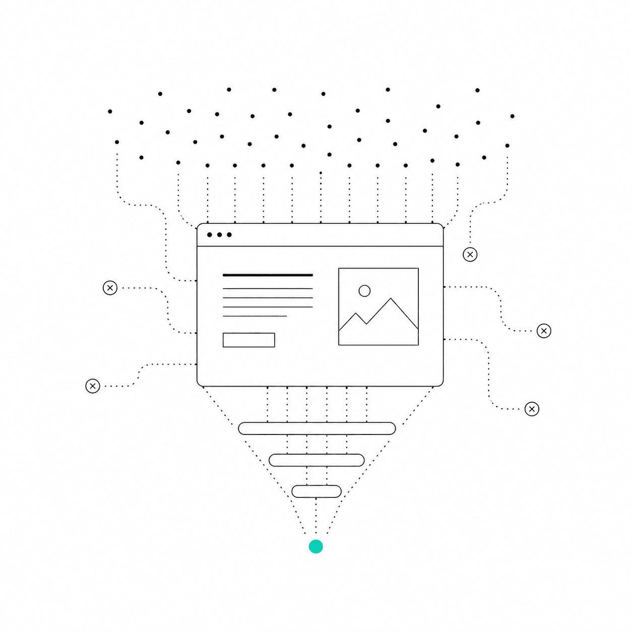
Most business websites don't fail loudly. They fail quietly: traffic arrives, people scroll, and nothing happens. No calls booked, no forms filled, no sales. The site "works" — it just doesn't convert.
We audit a lot of websites before rebuilding them, and the same six problems show up almost every time. None of them are exotic. All of them are fixable.
1. The visitor can't tell what you do
You have roughly five seconds before a visitor decides whether to keep reading. If your headline says something like "Empowering synergy through innovation," they're gone. The test is brutal and simple: could a stranger read only your hero section and accurately describe what you sell, who it's for, and what to do next? If not, nothing below the fold matters.
2. There's no single, obvious next step
Conversion is a path, not a property. A high-converting page decides one thing it wants the visitor to do — book a call, request a quote, start a trial — and repeats that action consistently. When a page offers six equally weighted buttons, it converts like a page with none. Every extra choice taxes the visitor's attention.
3. Trust signals are missing where decisions happen
People don't read testimonials for entertainment — they look for proof at the exact moment of doubt. That means social proof belongs next to the ask: client results beside the pricing, testimonials beside the booking button, logos near the top. A wall of praise on a separate page that nobody visits does nothing.
4. The page is slow
Speed is a conversion feature, not an engineering vanity metric. Every second of load time measurably increases abandonment, and mobile users on real-world connections feel it worst. Oversized images, unused scripts, and render-blocking third-party tags are the usual culprits — and they're all solvable in a day.
5. Friction in the ask
An eleven-field contact form is a polite way of saying "please don't contact us." Ask for the minimum you need to start the conversation — usually a name, an email, and one qualifying question. You can collect the rest after you've earned the reply. The same logic applies to booking flows: every extra step sheds real prospects.
6. The site talks about you, not the client
Count the sentences on your homepage that start with "We" versus the ones that describe the customer's problem. Visitors convert when they feel understood, not when they're impressed. The most effective structure we use is simple: their problem → the outcome they want → proof you deliver it → the step to take.
Where to start
- Rewrite your hero headline to pass the five-second test.
- Pick one primary call to action and make it the only prominent button.
- Move your strongest proof next to the point of decision.
- Measure your load time on a mid-range phone, not your office fibre.
- Cut your contact form to three fields.
None of this requires a rebuild — but if your platform makes these fixes hard, that's usually the moment businesses call us. Conversion problems are design problems, and design problems have answers.